How to Create Interactive Charts with PxPlus
Charts provide a good way for businesses to see the big picture. With a glance, personnel can analyze a breakdown of their yearly sales by month, product, or customer.
What if they want to find out more information while they’re looking at a chart?
With PxPlus, you can create interactive charts that let users not only see pictorial summaries of their data, but also drill down to the underlying information with a single click.
To provide this type of intuitive data presentation, you need:
- A graphical charting tool
- An easy way for users to ask for the specific information they need
- The ability to provide the detailed information being requested
The tools that make it possible
PxPlus has three features that make interactive charts possible:
[sidebar width=”260″]See It In Action
Do you want to see how easy it is to make charts come to life for your users? Check out the video “Create Interactive Charts with Query+ and the Charting Alternatives in PxPlus.”
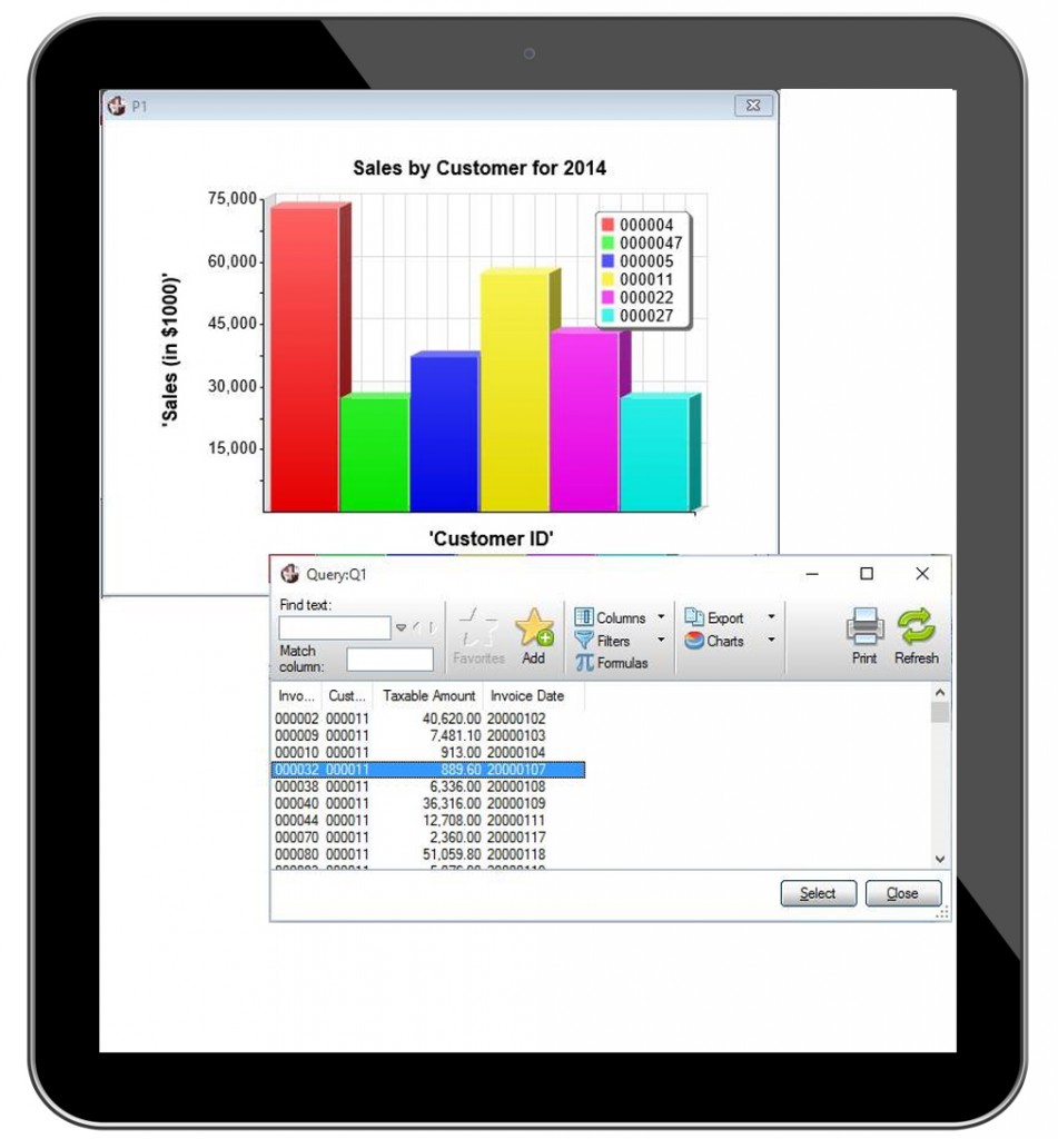
In the video, David Twiddy, PVX Plus Sales and Account Representative, walks you through creating an interactive bar chart that breaks down a company’s annual sales by customer. After looking at the bar chart for general trends, users can click each column to see each customer’s invoice data.
Watch the video.[/sidebar]
- PxPlus charting capabilities — Along with its own internal chart control, PxPlus supports three alternative charting tools: FusionCharts (free version), Google Interactive Charts, and RGraph charts. All of these options provide visually appealing charts that are both interactive and animated. You can create bar, scatter, and other types of charts that will display the underlying data instantly.
- Chart control properties — Using the chart control properties, you can easily detect and process events relative to the data selected by the user. In addition to detecting events, you can use the chart properties to customize the look and feel of charts. For example, you can set a chart’s color palette and format its text to your liking.
- Query — Once you have determined what portion of the chart the user has selected, you can use the PxPlus Query subsystem to present the more detailed information.
Better yet, the new Query+ interface allows you to take tabular information and information from existing queries and create charts from them directly. Thanks to this new query interface, the underlying data that the user wants to see is displayed as the user mouses over the chart.
The ability to visually view and drill down to detailed data can give businesses a competitive edge as they make better, faster decisions.
[cta]Do you have a question about PxPlus or iNOMADS? We’re here to help. Contact us any time; simply email us at theplus@pvxplus.com or call 1-888-975-PLUS.[/cta]


